Designing how we design
When I joined, design was mostly seen as a service: fragmented, reactive, and dependent on other teams’ decisions. I quickly realized that to make a real impact, we needed to change not just what we designed, but how we designed.
I started by building trust and structure, introducing planning rituals, clearer roles, and shared tools. Over time, our work evolved from creating isolated deliverables to shaping connected experiences across channels.
We formalized Design Ops practices that made design visible in company planning and execution, and we began defining early frameworks for Research Ops to give structure to how we learn from users. Through initiatives like the Design System and Experience Governance, I helped the company design how it designs, establishing the culture, processes, and tools that sustain design at scale.
Outcomes
2.9→4.7
App enrollment increase
Contact center calls
Context
The mobile app was a critical touchpoint for our users yet it suffered from inconsistent UX, fragmented information, and confusing flows.
We had an opportunity to redesign not just the interface, but the entire user experience with a focus on clarity, functionality, and measurable outcomes.
This effort built upon the foundations of our Designing with Data initiative, and marked a key moment in positioning design as a strategic partner in product development.
Challenge
How could we optimize and scale the app experience to make it more useful, consistent, and centered on real user behavior?
Solution
-
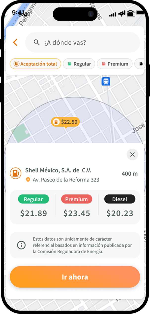
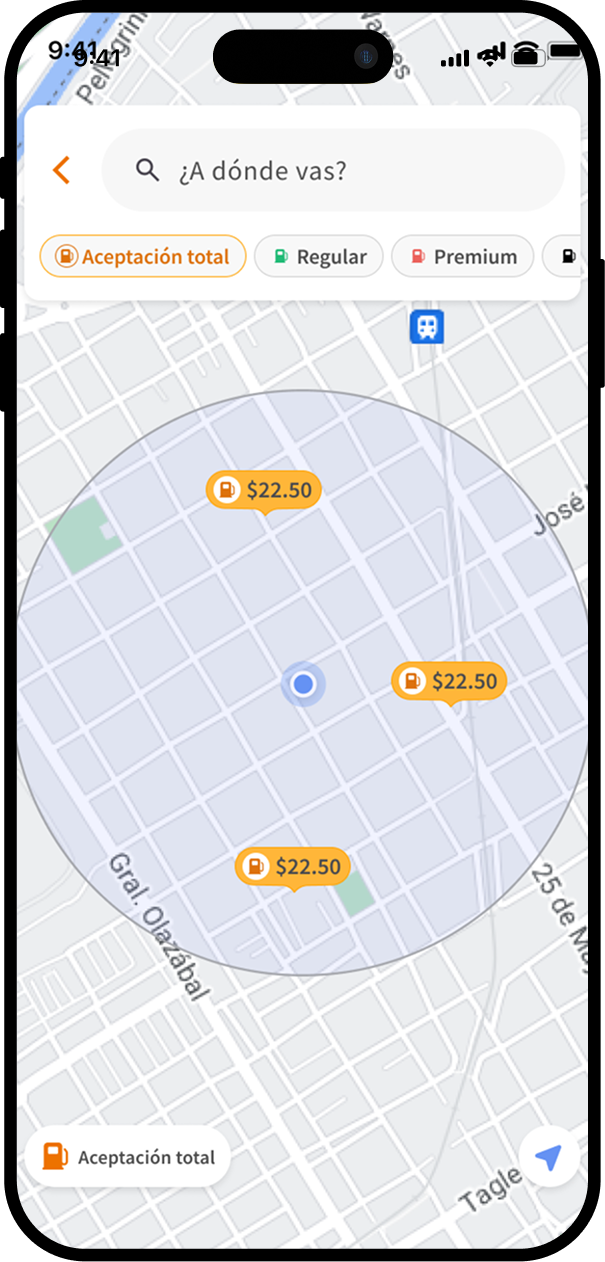
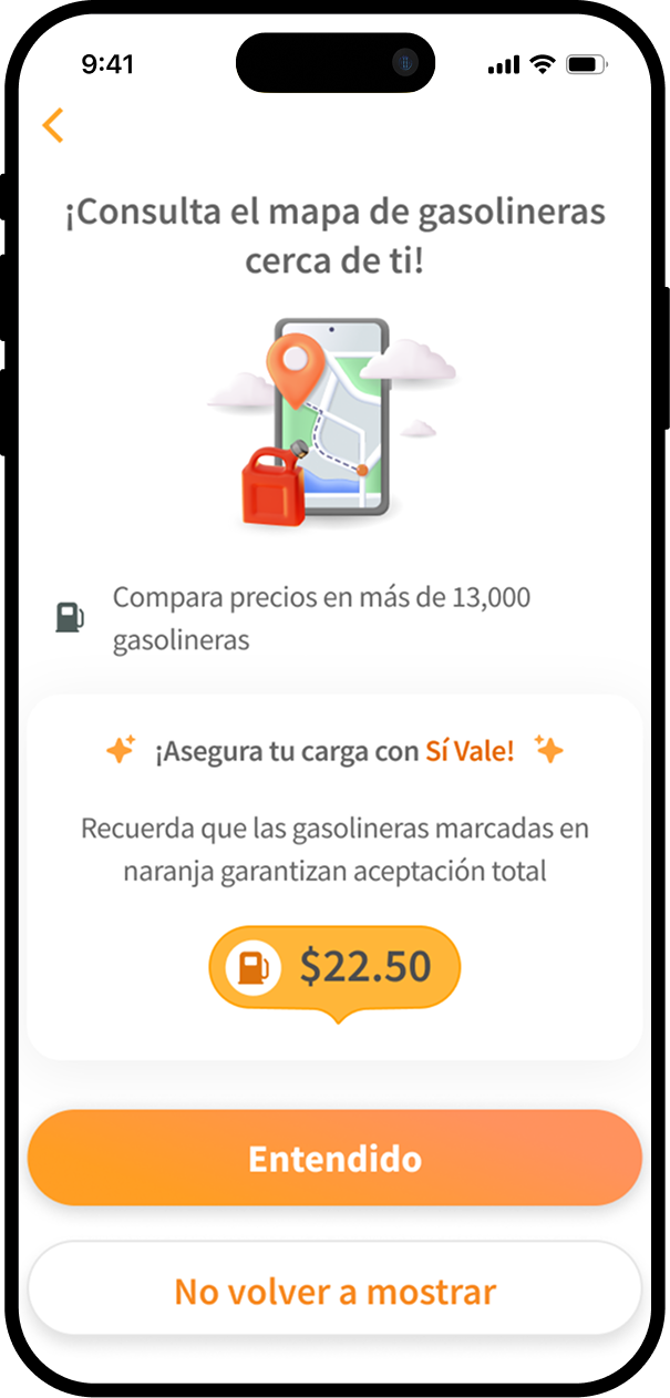
1. Fuel MapRedesigned the experience to make it more intuitive, visually clear, and functional on the go, helping users quickly find nearby stations and compare prices.
-
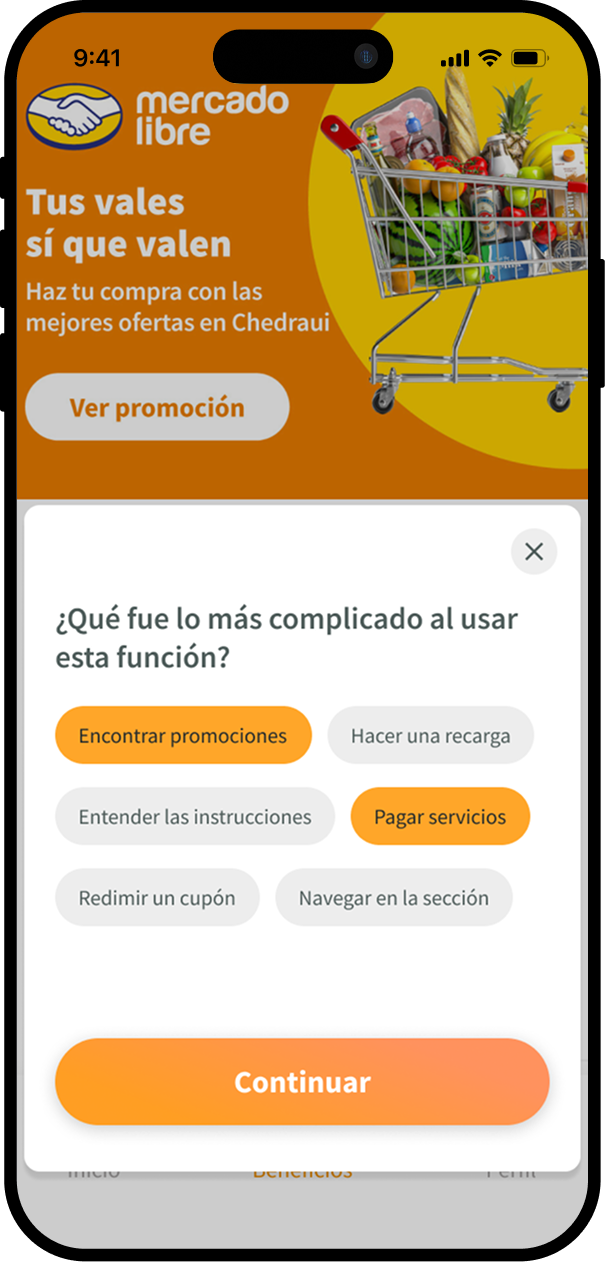
2. New Benefits SectionUnified Promotions and Benefits into a single, clearer, and categorized experience.
- Migrated all flows to the native app, eliminating the need to open a browser
- Defined rules to display different types of ads depending on strategic partnerships
-
3. User Profile OptimizationSimplified navigation, reorganized key information, and streamlined frequent actions like editing and updating data.
-
4. Enrollment FlowUpdated the cardholder onboarding to make it more straightforward, understandable, and visually consistent with the rest of the app.
-
5. Merchant Map MVPCo-designed with Product an MVP for exploring affiliated merchants, with filters by location, category, and relevance.
-
6. Notification CenterCompletely redesigned the notifications experience to improve hierarchy, reduce friction, and increase visibility of relevant messages.
Outputs