Centeo
Supporting the translation of strategy into polished, high-fidelity interfaces. Shaping layouts and components to democratize access to financial services.
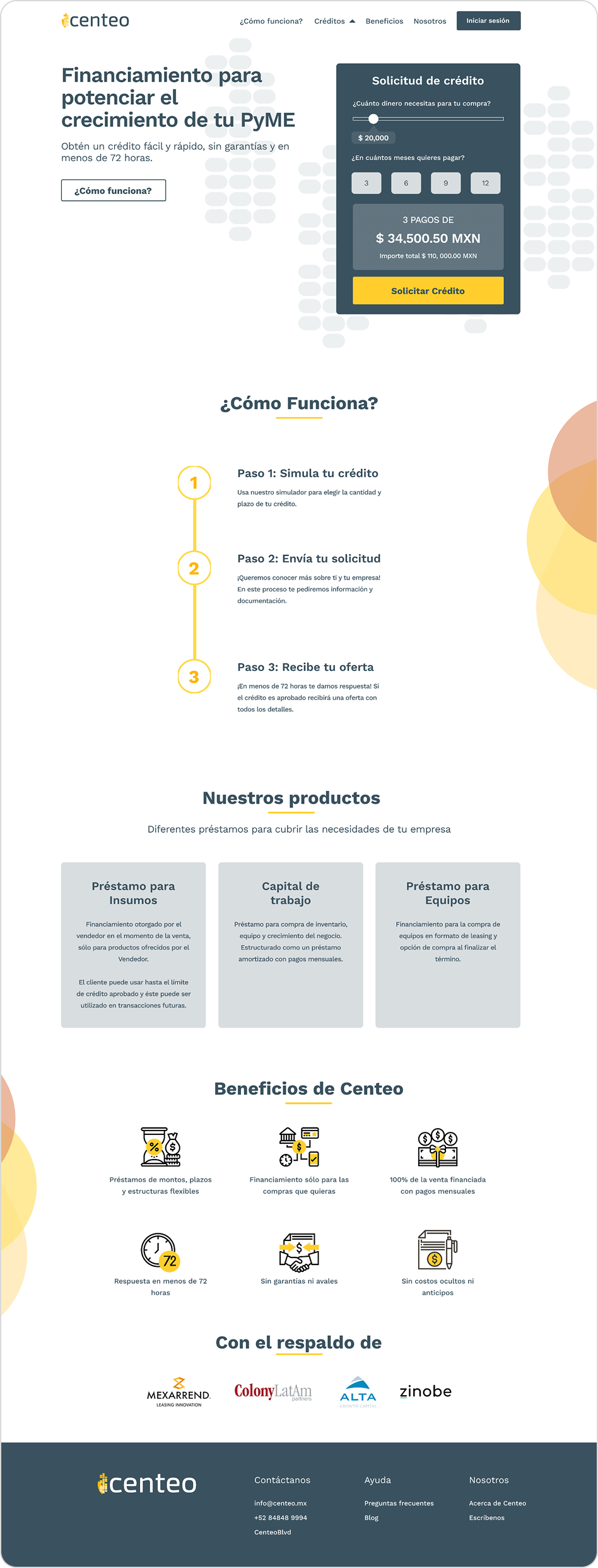
The SME Challenge
Centeo is a fintech company providing fast, flexible financing for SMEs in Mexico. Their mission was clear: democratize access to world-class financial services.
However, their initial brand expression leaned heavily on financial jargon, risking alienation of local business owners who needed clarity and trust above all.

Approachable yet Credible
"How might we translate Centeo's sophisticated vision into a digital experience that is culturally relevant for Mexican business owners, without losing investor credibility?"
Clarity through Design
My role focused on UI execution, ensuring strategic intent was reflected in clear interfaces.
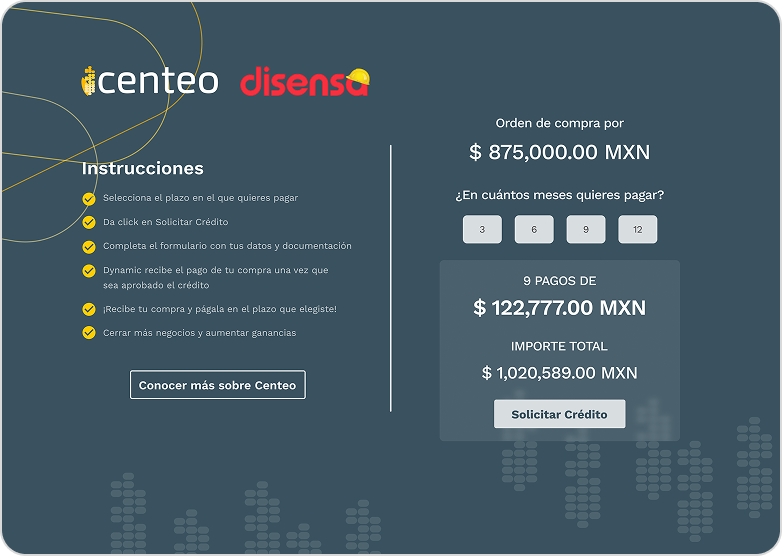
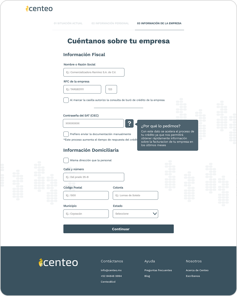
Reframed complex language into straightforward messages with clear visual hierarchy.
Extended visual identity into a cohesive UI library for trust and professionalism.
Introduced UI elements tailored to resonate with the Mexican SME audience.
Improved trust and accessibility, aligning positioning with everyday needs of Mexican owners.
Streamlined onboarding flow reduced drop-offs and clarified product communication.